The Nitro Query app included with Valence is designed to quickly take large volumes of IBM i data and make it easily accessible to your users in the form of a dashboard or query.

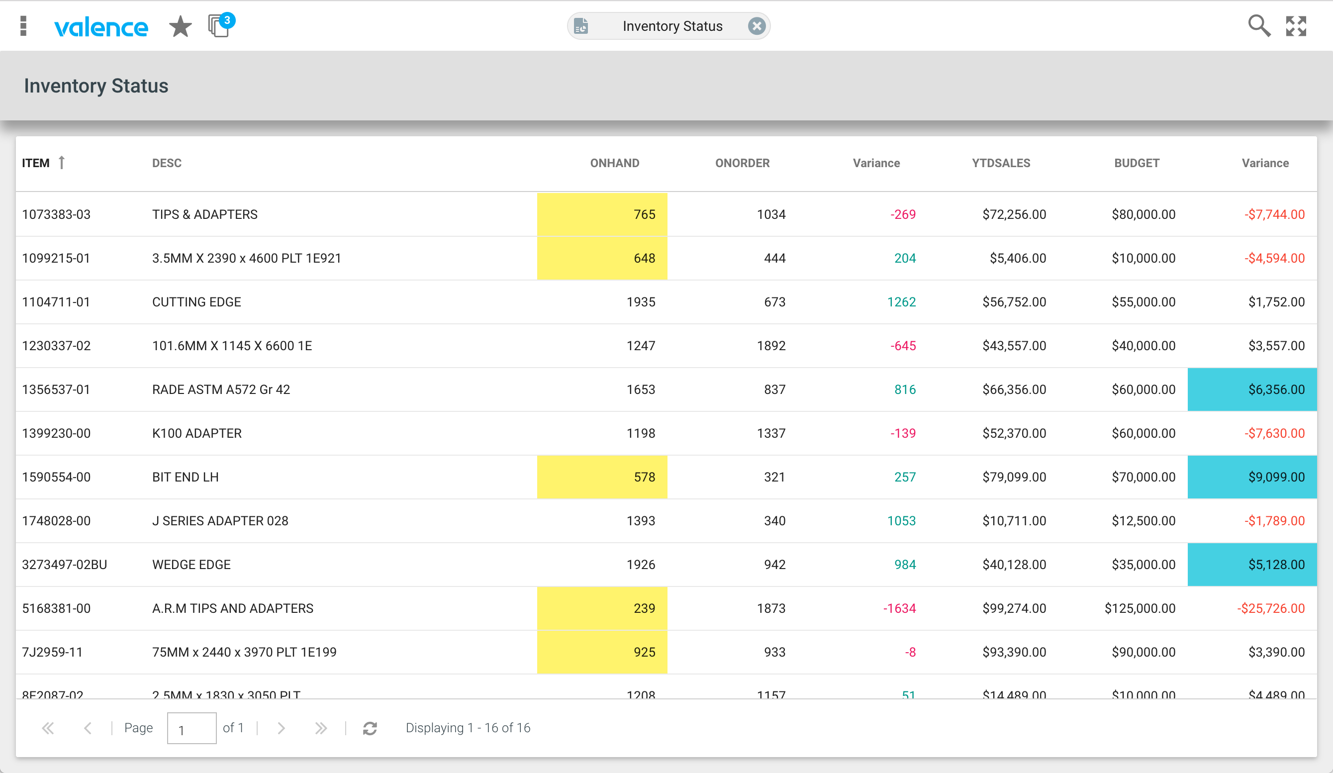
Management and company executives in particular love the intuitive nature of being able to click through charts, graphs or grids, and optionally download the data to Excel. And, of course, IT developers love the ease and speed in which these apps can be created for both desktop and mobile interfaces. With the latest Valence 5 build (5.0.20170221.0), it’s now possible to draw attention to specific cells within a Nitro Query grid by applying different text or background colors based on a set of rules you define. For instance, negative inventory numbers in a particular grid column could be highlighted red, while above-budget sales numbers in another column could be marked green. You can even adjust the color of a non-numeric cell based on its contents.
This tip walks you through the process of adding a dash of color to your grids. Cell color formatting is defined on any grid widget in the same area in which you configure its alignment or renderer. This is accessed within the Columns tab of the widget by hovering your mouse cursor in the area to the right of the Width/Flex column and clicking on FORMAT.
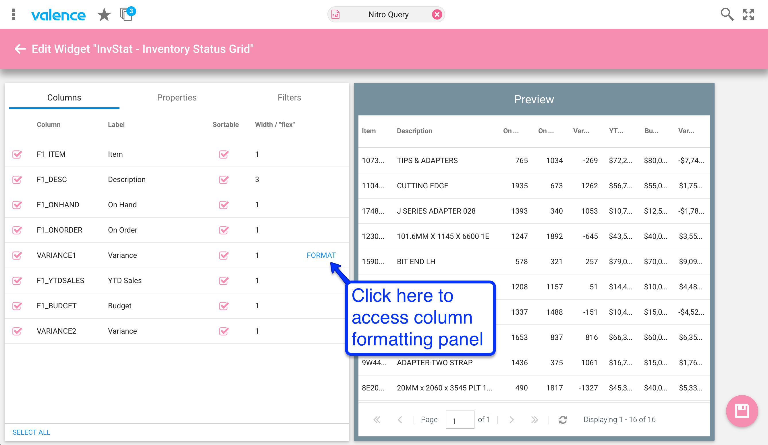
Once you’ve accessed the column configuration, you’ll notice there is a COLORS button in the upper right. Click on that to set the background or text color for the selected column.

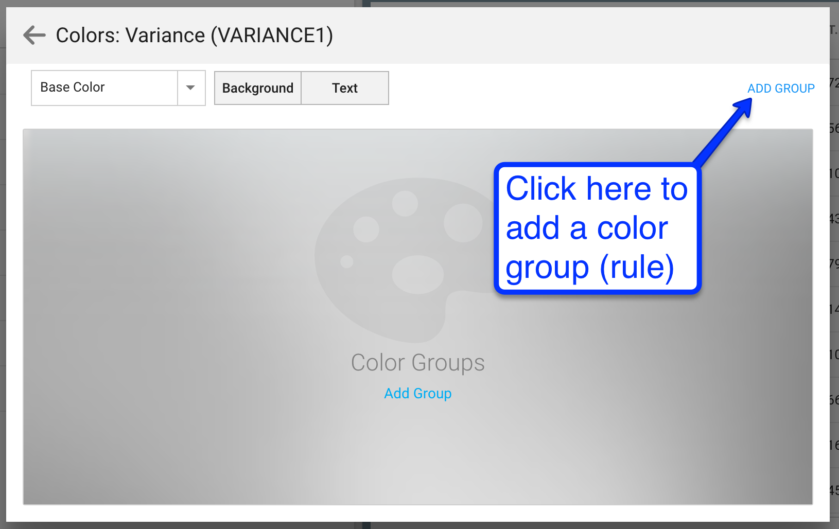
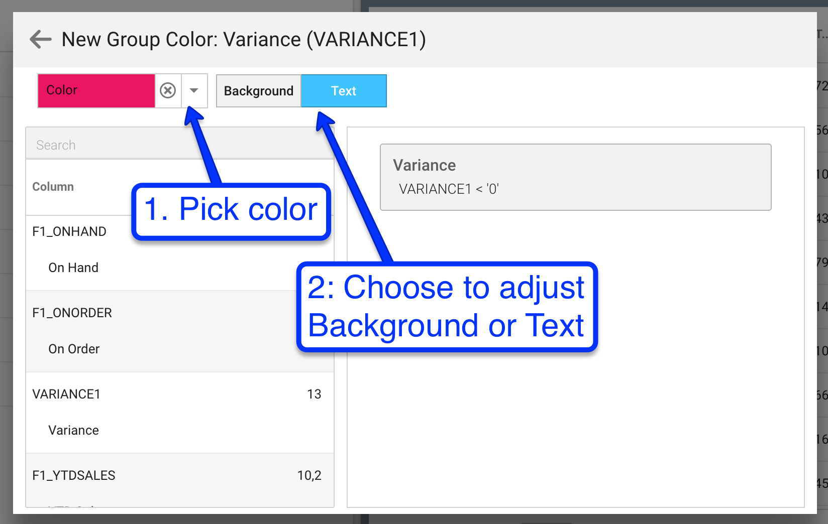
Initially the color configuration window shows the default color configuration for the column (Base Color), which is black text on a white background. Here you could change the column to have a special text color or background color regardless of its value, but let’s say we only want to change the cell’s text color to red whenever its value is negative. To do that we first need to add a color group, which is where you specify the rule(s) for determining when a color adjustment should occur in this column.
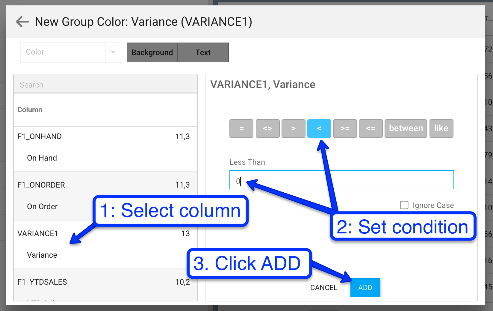
At this point you would now (1) select which column should be used to determine the cell color for this column (it doesn’t necessarily need to be the same column as the one whose color you’re adjusting), (2) specify a condition that should trigger the color rule to take effect, then (3) hit the ADD button. You can repeat this process to add additional conditions for this particular rule.
With one or more conditions set, you complete the process by indicating the color to apply to either the cell background or cell text whenever the rule condition(s) apply.
Click the left arrow button in the upper left corner a couple times to return to the column configuration, then click OK. Repeat this process on each column for which you want to adjust the color, then save the widget. Your users’ eyes will naturally be drawn to the grid cells with non-standard colors, so be sure to use this feature sparingly for maximum effect!