It is often said that a picture is worth a thousand words, and in business the most fundamental expression of that saying comes in the form of charts and graphs. To that end, Nitro App Builder offers a wealth of configurable chart widgets that can be used to effectively summarize data and trends from any IBM i system.

Keep in mind that the principle of “less is more” often applies when showing data in a chart or graph. Placing too many numbers or figures on a chart can defeat the purpose of providing an easy-to-interpret overview of data. This is where drill-downs and tooltips can provide users that extra element of information without cluttering up the main display.
In this tip, we’ll be focusing on some recently added tooltip properties that make it possible to show multiple lines of data inside the tooltip window. The charting widgets in NAB do not allow html formatting within tooltips, so you can’t use <br> line feeds like you can in, say, grid columns. But, provided you’re running on Valence build 6.0.20211209 or higher, you can work around this restriction by exploiting these special properties in a custom tooltip configuration.
To illustrate the concept, let’s say we have a column chart widget that shows total sales by country, but for added context we’d also like to make it possible for users to quickly see how many customers and orders make up each individual bar in the chart. To do this, we’ll make sure the desired “background” elements are included in the chart’s data source, then put the supplemental data inside the tooltip.
Step one, of course, is to create the data source that includes our pertinent country names, and the total sales, total orders and total customers for each country. For our purposes, we’ll use the following SQL statement to provide the desired data from the example customer master file included with Valence, DEMOCMAST, along with the example customer order header and detail files, DEMOORD_H and DEMOORD_D:
SELECT
  sum(f3.ordqty * f3.price) AS totalsales,
  count(distinct f2.orderno) AS totalords,
  count(distinct f1.cusno) AS totalcusts,
  f1.ccountry AS country
FROM
  DEMOCMAST AS f1
  INNER JOIN "DEMOORD_H" AS f2 ON f2.cusno = f1.cusno
  INNER JOIN "DEMOORD_D" AS f3 ON f2.orderno = f3.orderno
GROUP BY
  f1.ccountry
ORDER BY
  totalsales DESC
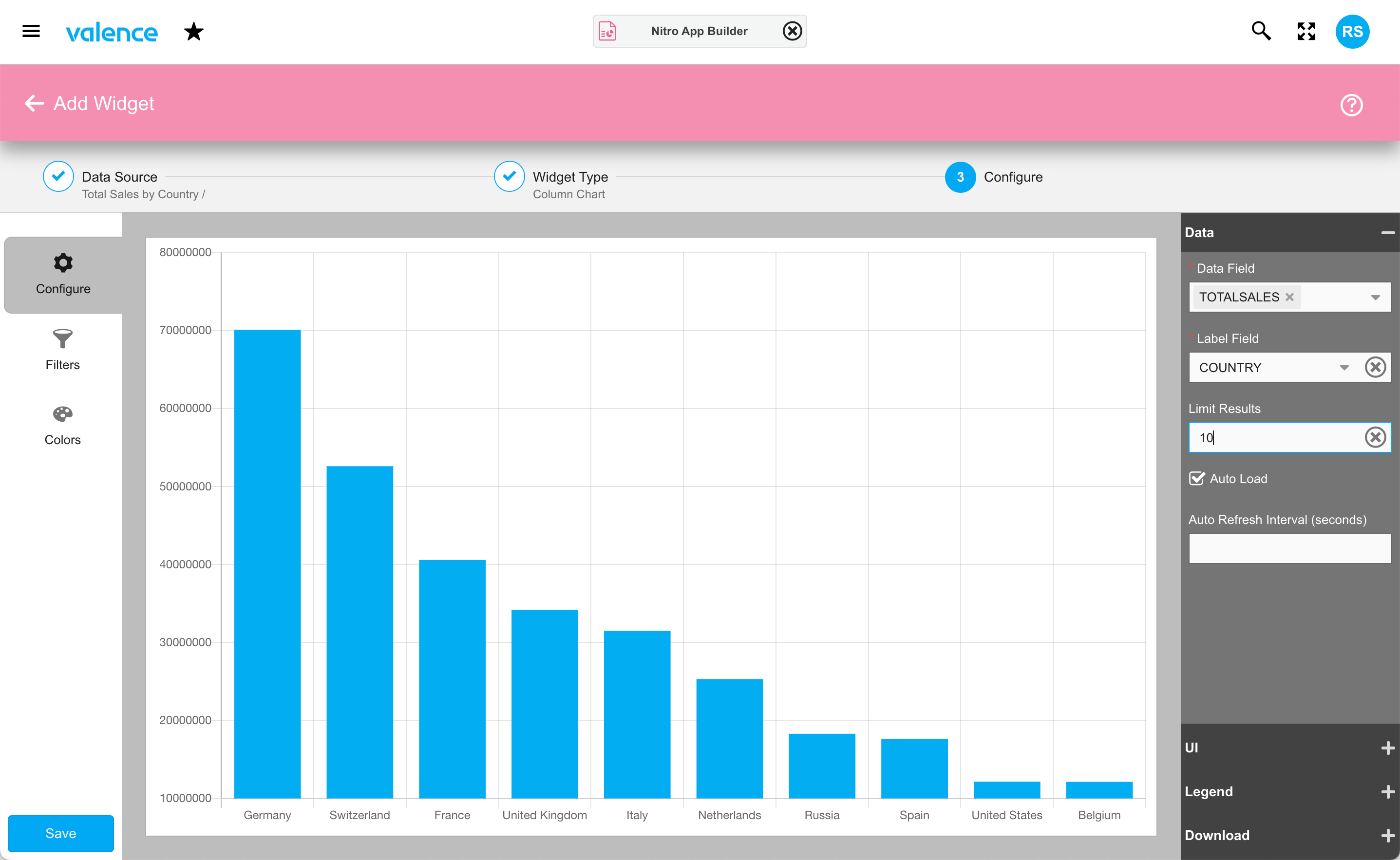
With the data source saved, the next step is to create a chart widget to cleanly render it. Using the row menu option adjacent to the newly created data source, click on “Create Widget” and then select the “Column Chart” tile to begin the configuration process for our chart. In this case, we want to show the total sales on the Y axis and the country name as the X axis, limiting to the top ten countries. Hence our Data configuration should be set as shown here:
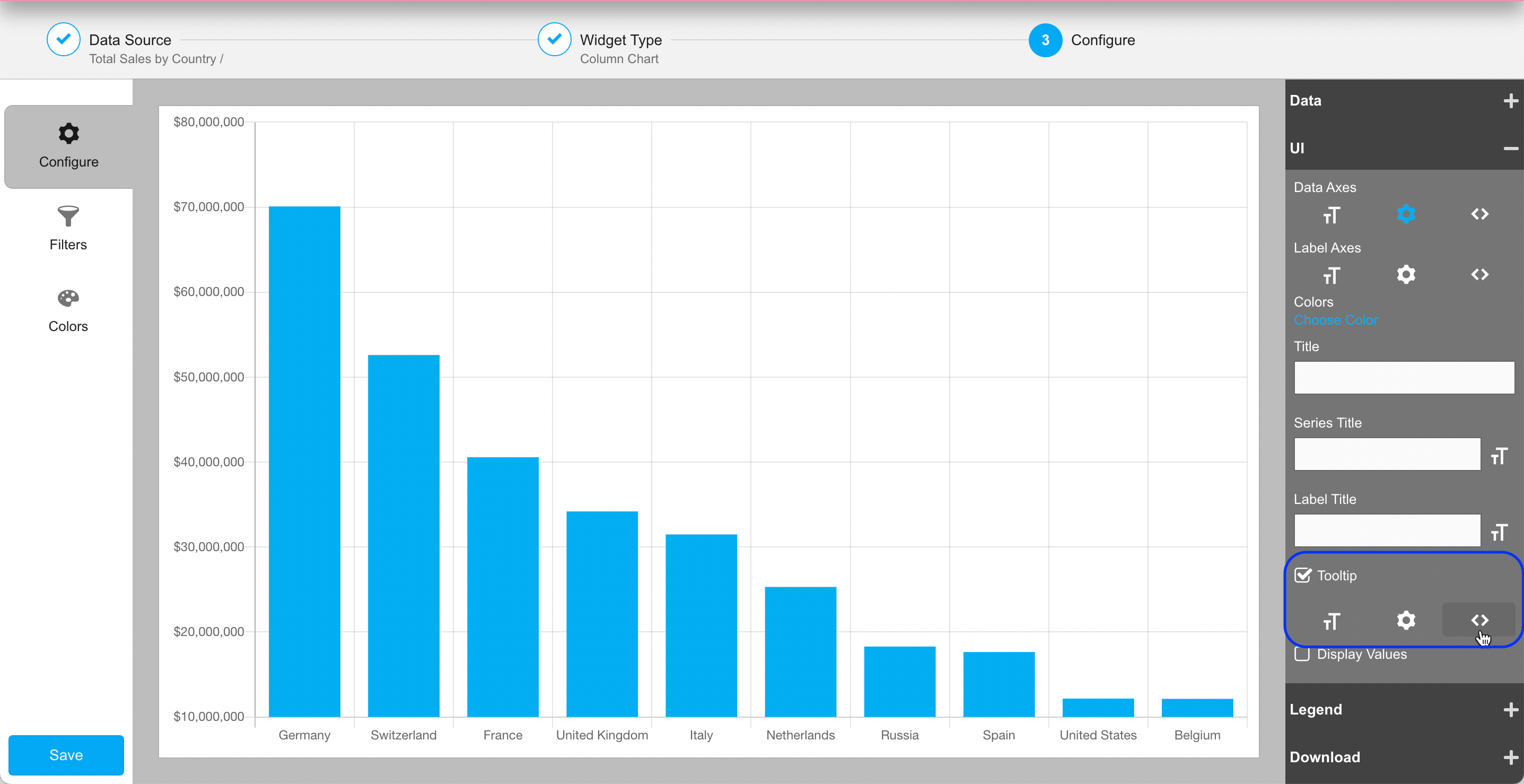
Clean and simple to read, our users won’t need a degree in calculus to understand what’s depicted here! Now, to add additional context to each bar showing total sales, we can use a mouse hover action in the form of a tooltip to show the underlying details behind each bar – namely, the total number of orders and the total number of different customers making up the respective sales totals for each country.
To do this, we’ll expand the UI section, check on the “Tooltip” checkbox, then click on the underlying <> button to set up a custom tooltip configuration:
As described in the documentation, there are 10 tooltip properties you can override in the custom configuration:
- beforeTitle: Text that is shown as the very first line of the tooltip, prior to any “title” specified
- title: Text that is shown as the title of the tooltip, below any “beforeTitle” specified and prior to any “afterTitle” value. If no title value is specified then it defers to the value associated with the label field in the widget’s Data configuration.
- afterTitle: Text that is shown immediately below the title value
- beforeBody: Text that is shown immediately prior to the data value field (referred to here as the “label” property)
- label: Text that is shown in the center of the tooltip. If no label value is specified then it defers to the value associated with the data field in the widget’s Data configuration.
- afterLabel: Text that is shown in a line immediately following the label (data field) value
- afterBody: Text that is shown in a line immediately following the body section (the label), subsequent to any “afterLabel” specified
- beforeFooter: Text that is shown at the bottom of the tooltip, prior to any “footer”
- footer: Text that is shown at the bottom of the tooltip, after any “beforeFooter” and prior to any “afterFooter”
- afterFooter: Text that is shown at the very bottom of the tooltip
To clarify, a tooltip window has three “sections” — a title section, a body/label section, and a footer section. By default, a tooltip has two lines consisting of a title and a label, but you can override those default values and add up to 8 more lines using these properties. All text in the title and footer are shown in bold, while text in the body/label section is regular.
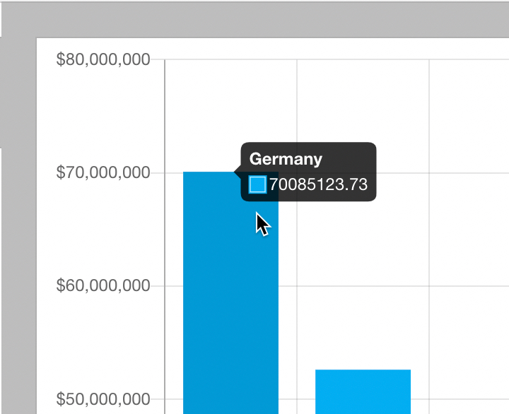
In our case, when we hover the mouse over any of the bars, the default title and body simply shows the country name followed by the precise dollar value total:
Of course, we could change the numeric formatting using the cogwheel function of the tooltip, but we want to go further than that to include additional details beyond the default values — specifically, the total number of customers and the total number of orders making up the sales, which we’ve already included in the data source above.
So in the custom tooltip format window, we’ll create a simple function to configure the tooltip as desired. Note that we can access the dollar value of the current bar via the “value” variable, and any values in the corresponding data source record via the “rec” variable. With that in mind, we can override some properties to provide users with useful supplemental details as follows:
return {
    label: 'Total sales: ' + Ext.util.Format.usMoney(value),
    beforeFooter: 'Total Customers: '+rec.get('TOTALCUSTS'),
    footer: 'Total Orders: '+rec.get('TOTALORDS')
}
Note that when overriding the tooltip in this manner, the label property MUST be specified, while all other properties are optional. The configuration in this example results in a tooltip that looks like this:
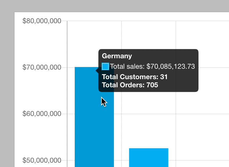
Thus you’ve created a tooltip mechanism to show users instant supplemental summary data for each country — there’s no added delay of having to call the server to pull the additional information.
Of course, for added interactive value you could create a separate data source and grid to list all customer orders, then use a behavior action in your app such that clicking on a bar would present the orders grid in a pop-up window, filtered by the corresponding country. This concept is shown in the Warehouse Dashboard example app, wherein you can click on slice in the pie chart to see a pop-up list of early, late, or on-time orders.