
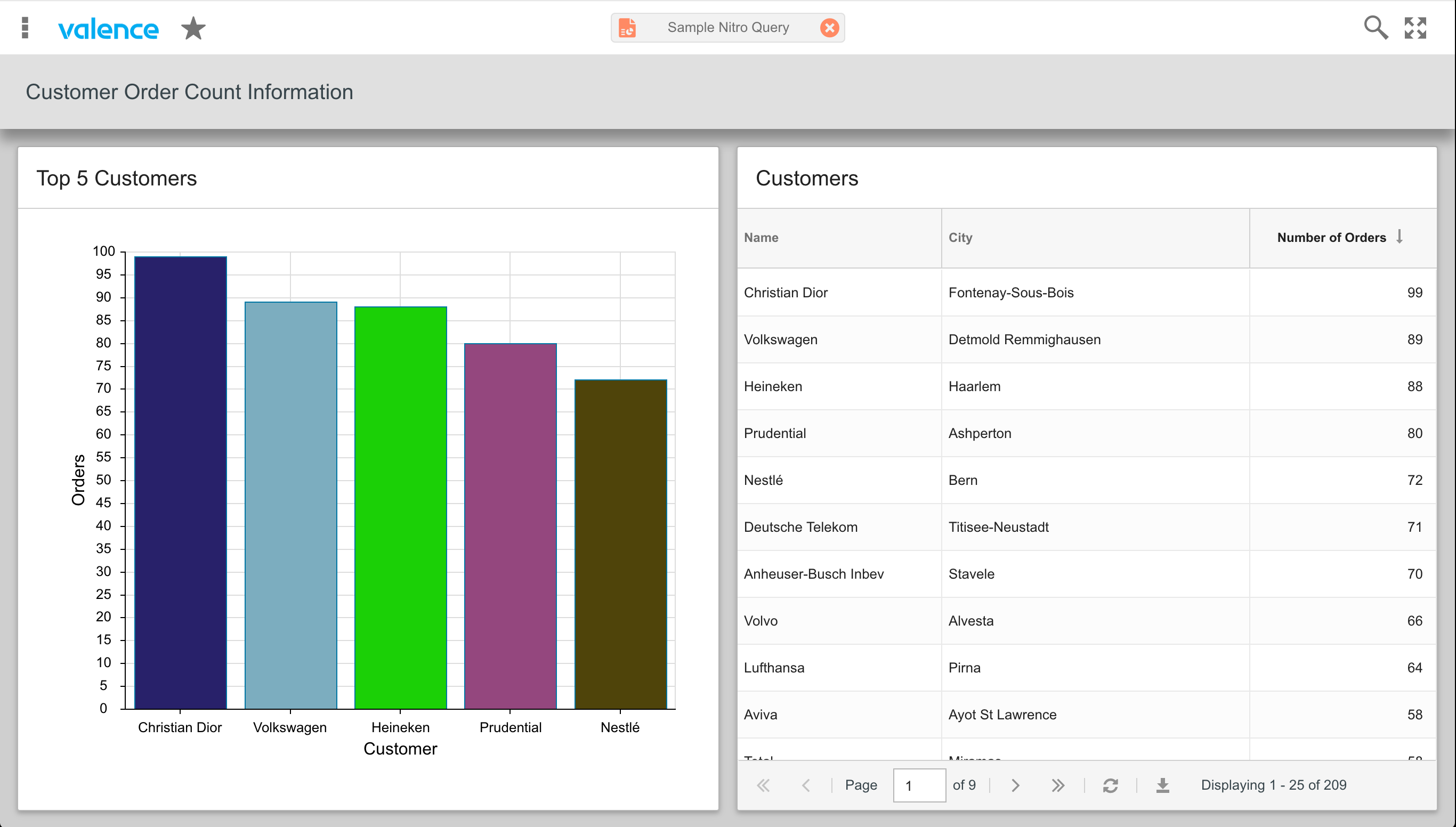
Nitro Query apps containing charts or graphs can make conveying your company’s business trends or performance metrics much more effective than showing raw numbers alone. It’s particularly common (and easy) to create a dashboard app that includes a grid of monthly sales details supplemented by a chart showing month-to-month performance. This adds some great context to the lists of numbers. By default the colors of the pie slices or bars in chart widgets are set randomly – hence they look different each time you refresh. But you can add extra meaning to your visuals by having different colors applied to the elements based on their numeric values. For instance, on a bar chart depicting monthly sales, you could have the bar turn red when a number falls well below budget, yellow when it’s near budget, and green when sales have far exceeded budget. So let’s walk through the process of setting bar chart colors by way of a quick example. We’ll take the existing “Sample Nitro Query” app that is included with Valence, which includes both a grid and a bar chart, and change the colors for the bars in the Top Five Customers bar chart based on a target for the number of orders. For reference, here’s what the app looks like in its original unaltered form:
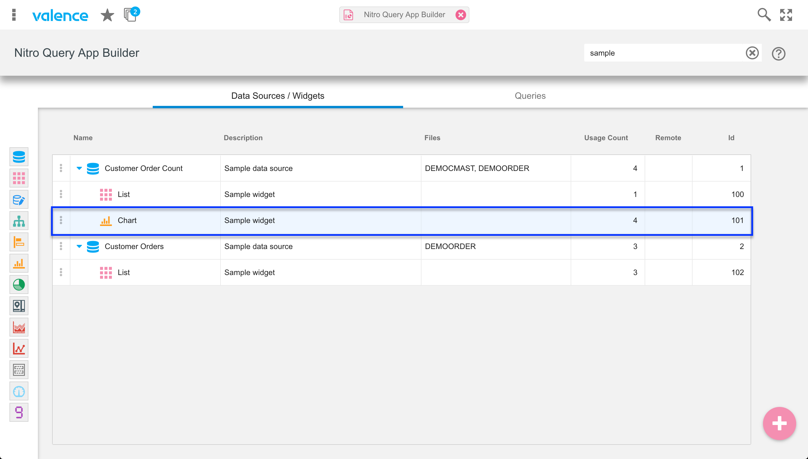
We’ll begin by getting to the appropriate spot in the Nitro Query App Builder app. Find the sample bar chart widget, which should be ID 101 in the Data Sources/Widgets list (you can enter “sample” into the search field in the upper right to quickly locate it)…
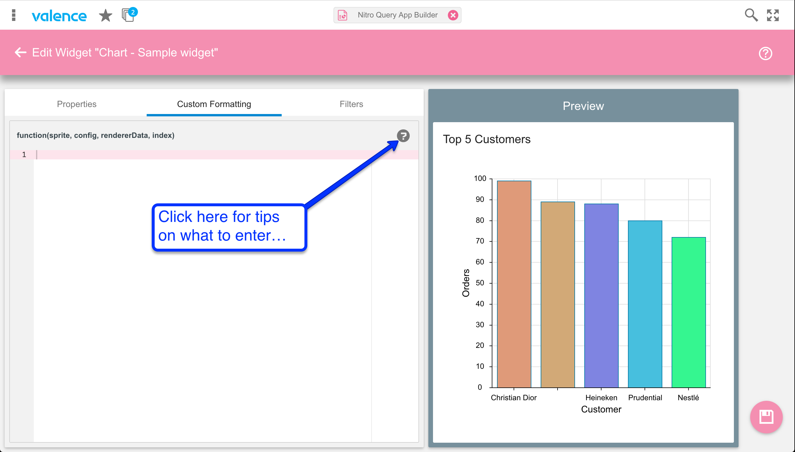
Next, click on the “Custom Formatting” tab. This is where the magic will happen – we’ll be entering JavaScript code inside a formatting function for the underlying chart. You can click on the question mark for guidance on how the code can be entered, along with some sample colors…
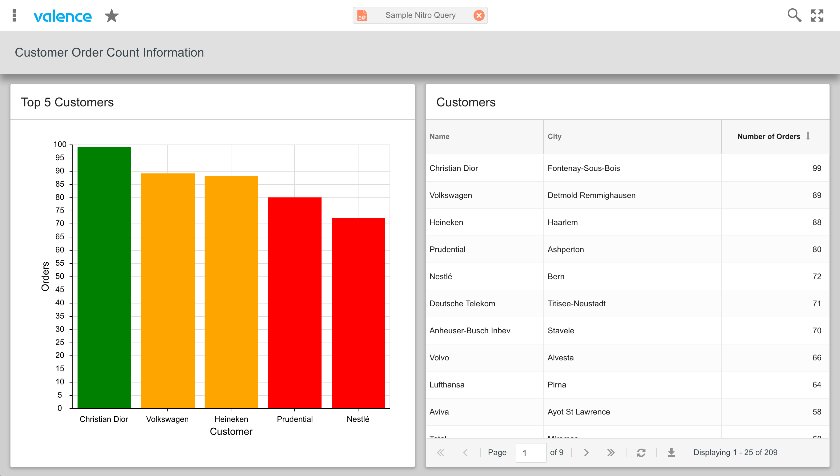
Not that this would make much sense in a real business environment, but for demonstration purposes let’s say our company has a desired target threshold of 90 orders for each customer. So customers that meet or exceed that number should be colored green; We’ll say anything less than 90, but at or above 85, is considered marginal, so customers at this level will get an orange color; Finally, customers falling below 85 are underperforming so they get colored red. To facilitate this we will need to insert JavaScript code that allows us to drill into the store behind the grid and extract the numeric values corresponding to the data being shown as bars. So we’ll begin by entering the following lines of code:
var store = rendererData.store,
    rec   = store.getAt(index);
The first line here gets us a reference to the store based on the third parameter passed into our function. The second line provides access to the data record specific to the bar being “colored” here. So the next step is to add a conditional expression to determine which color we want to apply. We’ll do that by extracting the numeric value of the bar element being adjusted, then using the setColor method to change it’s color. So let’s add the following code:
var v = rec.get('COUNT_ORDERNO');
if (v>= 90){
    return setColor('green');
} else if (v>= 85) {
    return setColor('orange');
} else {
    return setColor('red');
}
It’s important to know the name of the value field your data source is sending, which is pulled in through the rec.get() function. Note that instead of using reserved HTML color names you could set explicit hex codes in the setColor method – i.e., setColor(‘#FFA500’) instead of setColor(‘orange’). Some commonly used color hex codes are also listed on the help window. Once you’ve entered all the formatting code, click the Save icon and relaunch the Sample Nitro Query app. You should now see the new color rules being applied.
In cases where you have a multi-series chart, where the chart is showing the values on more than one field per record, your formatter will need one more line of code to determine which field in the row or column is being set, which may then affect what color you wish to apply. You can pull the field name being set out of the function’s sprite parameter, resulting in something like this:
var store = rendererData.store,
    rec   = store.getAt(index),
    v     = rec.get('valueField’),
    fieldName = sprite.getField();

if (fieldName === 'series1field') {
    // check v and return appropriate color for the series1 field
} else if (fieldName === 'series2field') {
    // check v and return appropriate color for the series2 field
}
Note that at this time you cannot alter legend colors on the chart to match the custom formatting, so you should avoid setting a Legend Position on the “Properties” tab. We will be introducing a new configuration option for altering the legend colors in an upcoming release.